Monday, December 12, 2011

No Winter break for me

As the fall semester comes to an end, I'v chosen a book to read in between semesters.  Interaction Design: Beyond Human-Computer Interaction, you can check it out if interested here.  Since I'll be talking about user interfaces more often, I want to educate myself on the theory behind it all.  I made sure to pick a book that is fairly recent and includes technology and practices used today.  I work in a highly fast paced industry, and I figure, I should know the latest and greatest in all aspects of the Human-Computer Interfaces.  This should be fun for me and beneficial to the readers (Hello!!?  Are you out there?)


Some bullet points about the book:
  • Boasts completely updated content on interaction design, human-computer interaction, information design, web design, and more
  • Includes coverage on the latest technologies and devices such as social networking, Web 2.0, and mobile devices
  • Develops and updates all featured case studies, examples, and questions to illustrate technical, social, and ethical issues you may face
  • Explains the various principles of interaction design and how to apply them
  • Places special emphasis on how to design interactive products that enhance and extend the way people communicate, interact, and work


Tuesday, December 6, 2011

Crystallographic "Drrrooooiiiiddd"


A while back I mentioned I felt brainwashed due to the subject of my symmetry art project. The infamous droid eye. I decided to go with the crystallographic approach of symmetry with the project. I remember my teacher checking out my progress and not knowing what the "Droid" eye was about. The minute I mentioned smartphone he laughed and pulled out his flip phone stating, "It's all I need". Regardless, he liked the focus I used with complimentary colors, and using colored pencils for the whole thing. I just have a few other things to do and it'll be done. I'v held off on it while I work on my repetition project and box art. The box art project will be fun, I'm either doing a scene from 5th Element or The Nightmare Before Christmas.


Sunday, December 4, 2011

Interfaces: Dear R.I.M.

RIM, or Research in Motion is the company that makes your blackberry. Some people don't even know that, but that's due to marketing and brand identity. RIM is king when it comes to email and corporate security.  RIM piggybacks off of the cellular carriers, and maintain their own network. Which is why we have seen a couple official announcements from the CEO in the past year or so due to major outages. With the introduction of the Pearl on T-Mobile, they were able to grasp the "consumer" side of the market. Which means there are going to be a lot more users that are going to use them for more than just their corporate email and making calls. Smartphones are difficult to get use to and learn to use, trust me, I know. So I have a couple suggestions real quick.

1.  Trackballs. You have moved away from them, but this is just a quick note to never use them again.  This isn't just for blackberries, but for any cellphone or mobile devices. Verizon Wireless had to implement replacement trackballs in their stores because they were replacing blackberries so many times due to the trackball not working. People's grimy, oily, dirty hands cause debris to get underneath and just makes it a burden to use sometimes. RIM has implemented trackpads and touch screens going forward it seems.  My opinion is to implement touch screen as often as possible as the primary navigation method. The biggest complaint when moving to touch screen, or choosing the Blackberry Storm was that people weren't able to text and drive as easily. Just sayin...

2.  Emil setup. Yes, you do have it as part of the setup screen when you 1st activate the phone, but don't let user choose to cancel it. When they do, you have them go into "setup" and then "email settings".  If you want to keep email as your advantage and keep the title of top dog, get email settings back to the main screen of icons.  Common sense is not so common when someone is learning how to use a new phone.  Also, your competitors don't require their users to sign into their blackberry accounts to manage them.  Sooooo many people forget their username and password, or think that it's asking for their email and password they are trying to add or re-validate.


Design and interfaces need to be simple, regardless of how advanced the device is your using.

Friday, December 2, 2011

Interfaces: Identify Me...

I wanna introduce something I'd like to review and possibly discuss as a common topic on my blog. User Interfaces! Ya' know, the translator for EVERYTHING you do that requires you to communicate with a computer system. It may seem out of context at first using the word translator to describe how we interact with computer systems. But, we do tell them what to do....and they do talk back to us, even when we hit the "cancel" button a zillion times. Your display acts like the window, you type in fields, click on icons to open/close programs, talk in the microphone, swipe the touch pad...All easy stuff to you and I, the users.

But,
Not so much for web developers, software programmers and engineers, game developers and anyone else that looks at codes all day long.


Like this picture here...


I would not want upload a picture to facebook if I had to look through a bunch of THIS....just to add it.

<!DOCTYPE html>
<html lang="en" id="facebook" class="no_js">
<head><meta charset="utf-8" /><script>window.Env = window.Env || {};(function(v) { for (var k in v) { window.Env[k] = v[k]; } })({"user":"1379750098","locale":"en_US","method":"GET","ps_limit":5,"ps_ratio":4,"svn_rev":479734,"vip":"66.220.146.75","static_base":"http:\/\/static.ak.fbcdn.net\/","www_base":"http:\/\/www.facebook.com\/","rep_lag":2,"post_form_id":"8faa4eca8b34dbf5154fc215548fec54","fb_dtsg":"AQDlRF2T","ajaxpipe_token":"AXhBb_bQa6hTgGbl","lhsh":"aAQGmmupC","tracking_domain":"http:\/\/pixel.facebook.com","retry_ajax_on_network_error":"1","ajaxpipe_enabled":"1"});</script><script>CavalryLogger=false;window._incorporate_fragment = true;window._script_path = "\/home.php";window._EagleEyeSeed="xUzq";</script><noscript> <meta http-equiv="refresh" content="0; URL=/?_fb_noscript=1" /> </noscript>
<meta name="robots" content="noodp, noydir" /><meta name="description" content=" Facebook is a social utility that connects people with friends and others who work, study and live around them. People use Facebook to keep up with friends, upload an unlimited number of photos, post links and videos, and learn more about the people they meet." /><link rel="alternate" media="handheld" href="http://www.facebook.com/" />
<link type="text/css" rel="stylesheet" href="http://static.ak.fbcdn.net/rsrc.php/v1/yt/r/XUz__kpqMvH.css" />
<link type="text/css" rel="stylesheet" href="http://static.ak.fbcdn.net/rsrc.php/v1/yx/r/ejJoiNmHkkP.css" />
<link type="text/css" rel="stylesheet" href="http://static.ak.fbcdn.net/rsrc.php/v1/yi/r/5PJKEUNv9AO.css" />

<script type="text/javascript" src="http://static.ak.fbcdn.net/rsrc.php/v1/yX/r/HN0ehA1zox_.js"></script>
<script>window.Bootloader && Bootloader.done(["M4\/yw"]);</script><title>Facebook</title><link rel="shortcut icon" href="http://static.ak.fbcdn.net/rsrc.php/yi/r/q9U99v3_saj.ico" /><noscript><meta http-equiv="X-Frame-Options" content="deny" /></noscript><style>.sidebarMode #chatFriendsOnline,.sidebarMode #fbDockChatBuddylistNub.fbNub,.sidebarMode #fbChatErrorNub{display:none}
.sidebarMode #pageHead,.sidebarMode #globalContainer{left:-90px;position:relative}
.sidebarMode .liquid #globalContainer{margin:0 90px}
.sidebarMode .fbDockWrapper{right:175px}
.sidebarMode body.safari4 .fixedScrolling,.sidebarMode .safari4.fixedBody #leftCol,.sidebarMode .safari4.fixedBody .MessagingReadHeader,.sidebarMode .safari4.fixedBody .MessagingContentHeaderWrapper,.sidebarMode .safari4.fixedBody .fbProfilePlacesHeader{margin-left:-90px}
.sidebarMode body.canvas_fixed.safari4 .fixedAux{margin-left:-91px}
.sidebarMode .safari4.fixedBody .fbStreamStickyHeader{margin-left:-110px}
.sidebarMode .timelineLayout .fbTimelineSideColumn{margin-right:-400px}
.sidebarMode .fbTimelineSideAds,.sidebarMode .fbTimelineScrubber{margin-right:-400px}
.sidebarMode .fbTimelineStickyHeader{right:310px}
.sidebarMode #fbPhotoTheater .container{margin-left:-570px}
</style><script>!function(a){if(a.clientWidth>1225)a.className=a.className+' sidebarMode ticker';}(document.documentElement);
!function(){var a,b=function(){a=a||document.getElementById('blueBarHolder');if(a&&'getBoundingClientRect' in a){var c=a.getBoundingClientRect(),d=Math.round(c.top)-

That's maybe the 1st 40 or so lines of code used to display the news feed page on Facebook
and it's even going renegade by going off the screen...

Thank God for that "upload pictures" button! So I personally thank developers and programmers for everything they do everyday, it makes me want to do it!!

User Interface is a broad topic. I'll be focusing on Mobile User Interfaces and Applications. Guess why!?Right now, I work for the largest cellphone company in the USA, Verizon Wireless. I do Technical Support on cellphones, pda's, crackberries, tablets, modems.....oh yeah....voice calling service too. I spend 40hrs a week helping people use their mobile devices. Setting up emails, refreshing a data connections, performing master resets, educating on the use of the product, sneaking in the tricks and tweaks of a phone to make the experience easier. It's also allowed me to gain a great deal of knowledge on how people use their mobile devices in their daily lives. What they hate, what they love, what's important to them, and what's not important to them (coughcoughpreinstalledappscoughcough).

I am all about customizing your phone or mobile device the way you want it to be. I'm no control freak, but if I want to see a little android guy pissing on the Apple logo as my bootup animation....let me freakin do it.  My first dive into customizing the look or theme of my phone started with the Samsung Omnia, a windows mobile phone. I had fun messing around in the registry and changing .cab files. Then Android OS came along and that blew everything out of proportion for me. I started designing themes, layouts, icons, changing my font, and lots of other things I'm sure i'll discuss. It's all led me on this path to want to design mobile user interfaces, hence why I'm back in school for graphic design. I can get very technical with people, especially when it comes to cellphones, there is alot involved with mobile devices. I want to help make the technical and "behind the scenes" prowess of a mobile devices easy for people to use and make it look %$#&'ing good.  I want to learn, share and possibly give pointers about the good, the bad, and yes....the ugly on mobile user interface.

Here's an example of future posts...


So of course I'm going to talk about Verizon's mobile website first. I'm not going to review the whole site or interface. I'm just going to exploit a really cool feature I found the other day that I think is perfect for a cellphone company to implement

That's right. When I went to Verizon's mobile site on my android phone looking for a case, it knew exactly what phone I had. I didn't have to keep looking through drop down lists to select my model, or heaven forbid even type it in.....while parked....of course ;). To be fair, I did check out AT&T's website...


+1 Big Red
                                                  -1 Others


I want my cellphone and a website to interact with each other seamlessly to make it easier to do what I'm doing on that website. The same goes for apps,honestly in my opinion, web apps and HTML5 is the way to go....start shredding the binds of the OS.


Monday, November 28, 2011

SteamPunk'd


Iv always been a fan of steampunk.  Recent movies, like "Stardust", "Suckerpunch", and even brand new "Hugo" depict great examples of the genre.

Tonight I'll be working on my art project where the focus is repetition.  Im all about the steampunk genre now, so im using pix like this to inspire me.  Im going for a clockwork feel...but gonna try to add something new and different.  I'll post on going progress


Sunday, November 20, 2011

Couldn't help it....


Click on pic for bigger pic...this is just an update to this random project I was asked to do at work for Verizon.  I'm pretty impressed with this doing it my 1st time, and it's not even done yet!!  Donna is gonna kill me for using her pic *evil grin*


*Updated*
This is the final version


Thursday, November 17, 2011

Project #1 - Expressive Type

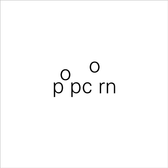
We've had weekly assignments in Typography to help teach concepts and tools that can be used in Adobe Illustrator and InDesign. Our first project focused on expressive type, done by typographically enhancing the meaning of a word.  We had to choose 6 words from a large list and enhance them, and also choose 2 of them to be printed out on foam core (Which is AWESOME! btw)  Here are a bunch of examples:


I got kinda frustrated with this project because I'm not familiar with the software yet. l didn't know whether to use Illustrator or InDesign, it seemed confusing at first.  We had been using InDesign for the weekly assignments, and that was just applying adjustments to text and layout.  Kerning, leading, baselines, drop caps, margins, stuff like that.  That stuff is a breeze now, ha ha...well sorta.  

I'm hitting the mac lab as often as I can and doing online tutorials to teach me how to use Illustrator and InDesign now..  Our Teacher did not and assumed we knew the software already.  Gotta love adjunct teachers.

I got a B- 

I'm actually happy with the grade for it being my 1st project using this type of software.  Printing it out on foam core was cool too.  I could see myself doing that more often, even with my own artwork.

So here are the two I printed on foam core


Tuesday, November 15, 2011

Tuesday's Type: Roboto


The following article was originally posted by Matias Duarte, a Google employee on his Google+ page.  He's part of the Android Experience Team, so there was no hesitation in adding him to "My kinda Industry" circle in my Google+.  He goes into detail on how Roboto was created, the design process, and how its going to impact our daily lives.  I thoroughly enjoyed reading about the different elements that go into designing type for the mobile user interface.  Articles like this are inspiring to me, and I find myself soaking it all up like a sponge.  If you're reading this and on't have a Google+ account yet, get one!  Google Employees give "behind the scenes info", Graphic Designers share their knowledge, Developers and Programmers share the latest tweaks, hacks, and opions.  It's truly made jumping into the user interface design field easier and educational, and who should say "no" to networking with the experts.  Also here is a link for the download so you can start using it now!  I have it on my Droid X now  :p.

Hello RobotoWhen we announced Ice Cream Sandwich I also got a chance to introduce Android’s new typeface Roboto. Today I’d like to talk about how Roboto was born — why we decided to create it, and the design choices we made in the process.
Why replace Droid?Droid is a great font family which served Android well over the years, but it was designed and optimized for screens that were much lower in pixel density than today’s HD displays. To be legible at smaller sizes, and to avoid turning to anti-aliased grey mush, the letter forms had to be quite dramatic. They had a tall x-height and a very regular rhythm so that they snapped to the pixel grid crisply. The bold variant was significantly wider than the regular text, because when a letter’s vertical strokes are one pixel thick, the only way to be bold is to double! It’s no surprise that on high rez screens, and at larger more dramatic headline sizes, Droid struggled to achieve both the openness and information density we wanted in Ice Cream Sandwich.
What were we looking for?Most important was to create something that matched our ambitious design goals for Ice Cream Sandwich. Emotionally we wanted Ice Cream Sandwich to enchant you, to be attractive and eye-catching. Our new typeface had to be modern, crisp, and structured to match our new emphasis on open layouts and rigid grid alignments, but also friendly and approachable to make Android appealing, and a little bit more human. 
Interactive display is a new and still evolving medium and what it demands from type design is subtly and uniquely different from print. We wanted to take maximum advantage of ultra high density screens like that of Galaxy Nexus, yet still be crisp and legible on lower resolution displays like that of Nexus S. Because Roboto would be used for the UI we wanted to make the bold very similar to the metrics of the regular weight, so that text could gracefully switch from bold to regular (like when you read emails in your inbox). We also wanted to include tabular figures (numbers that are all the same width) so we could display times, dates and other counters without having the characters jump around.
Finally we wanted Roboto to make a design statement in and of itself, in the same way that we wanted every screen on the device to have a strong and unique design point of view. Yet, just like the rest of the UI, Roboto is ultimately a medium for your content. We wanted Roboto to have a design character that made it recognizable, to be distinctive when you were paying attention, but never be overbearing or distracting.
How did we make it?We realized early on that we needed something with a strong geometric backbone to hold up to our new open “Magazine UI” layouts. When we got rid of the boxes and bevels, dividers and other structural crutches, the more humanist fonts of our legacy felt uncomfortable and a little chaotic. Naturally we looked at some of the circle based geometrics like Avenir and Futura, but they’re very demanding in the rhythm of their metrics and ultimately were a little too soft for the crisp corners that we were using in the UI. The breakthrough came quickly when we settled on a straight sided grotesk.
Roboto’s straight sided capitals and distinctive racetrack-shaped rounded letters turned out to be perfect for our needs in a system font. It is space efficient and and holds its own for the short terse messages that are so common in UI. It has a high degree of compatibility with legacy designs created for Droid, because in almost all cases the same size Roboto sets in the same amount of space. Yet because of Roboto’s more structured forms we can actually set it smaller and with tighter line spacing, allowing us to put more information on the screen without inducing claustrophobia.
One of the potential drawbacks of a grotesk font is that the structured evenness of the type can make it more difficult to read. We started by softening up the lower case letters, and then experimented with opening up some of the glyphs to get a more diverse rhythm. We found that by adding a little more diversity to the lower case the font become more readable. In particular, we opened up the ‘e’ and ‘g’ while keeping the ‘a’, ‘c’ and ‘s’ characters closed. The rhythm starts to compare more to book types and makes for really nice reading over longer spans of text.
In the end we were iterating ceaselessly on minor details of the letters, extending the character set to Greek and Cyrillic, and tweaking the rendering so that Roboto would look just as good at all sizes and resolutions. In fact our work is not yet done as we continue to extend the character set and begin to hint Roboto so it works as well on computers as it does on Android devices. Still, I’m terrifically proud of the work the team and our lead typographer did in an ludicrously short amount of time. Roboto is a new foundation for Android and the team really deserves kudos for their accomplishment.
I hope you’ve enjoyed this little ‘behind the scenes’ peek at Android’s evolution. I had fun writing it, so let me know if you’d be interested in hearing more.

Wednesday, November 9, 2011

224 pages later...

I finished reading my 1st book on Typography!  "Thinking with Type" by Ellen Lupton. The book was $25, and an easy read.  It's broken into 3 chapters; Letter, Text, and Grid. Each subtopic was no more than 4-5 pages but jammed packed with lots of examples. Good examples, bad examples, they are all there. I was surprised to find out some typography teachers don't have a book requirement. I'm glad mine did. I notice things when looking at posters and flyers now for example. I'm paying more attention to layouts and their use of space on everything now.  This class, with the help of this book has totally changed the "type" of detail I'm paying attention to.

Friday, November 4, 2011

Posters! Flyers! = $weet $ide job$

When I signed up for typography this semester I had one thing on my mind. Fonts. Actually typeface would be the correct terminology for what was on my mind, which is the design of the letter forms. Font is actually the delivery mechanism. I find it easier to understand in digital terms, like my word processor providing me Helvetica in the bold font so that I can import it to adobe products for a rockin' poster or flyer for as the output. Either way, in this day in age, we all know what we mean when we use the two.  


There is so much more to Typography than typeface and fonts. It's true, watch the movie "Helvetica" (it's on Netflix instant and Youtube now). Typography is all about the style and appearance of something, printed or digital. Pictures are governed by rules of typography, the space you use in, out, and around the letters....all fall under Typography.  


My final project for Typography is to design a World Events poster. My teacher has us using Adobe Illustrator and InDesign, which are all new software products for me. I don't have those products myself, so I'm hittin' the Mac Labs at school as frequently as possible.  


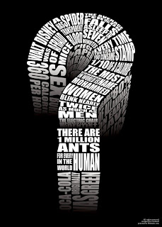
When I think of posters, I'm not gonna lie i think of pictures. This assignment requires we use only typography to express our message. I have definitely  seen many flyers in my day and posters, and these are some examples that I'v been viewing on the web to rattle my brain and get that creativity flowing.


Those are some great examples of posters that have no actual image, except for ones made by letters. I want to design posters and flyers like this. Practice makes perfect, even if I'm going for a digital or web format. Bottom line page layout and/or typography are key.


The thing that sucks about the project is that there are 10 topics to choose from, and we can't stray from the list. Topics like...

  • 2011 International Year of Forests
  • March  11, 2011 Japanese Earthquake and Tsunami
  • May 1, 2011, Death of Osama bin Laden
  • April 11, 2011 French legislation bans full-face coverings
  • July 11, 2011 Scandal brings end to The News Of The World


I chose the death of Amy Winehouse :( . I'm also doing an additional topic for extra credit.  Not sure what my 2nd choice will be yet. This project is no joke either, I have sketches, concepts, and the processes used to include, along with it being mounted. 20 sketches due next week.  That's 20 each topic.  Yes.  40.   *whip crack*


I'm starting this project early, and I'm really gonna work hard to impress with these projects so I can include them in a portfolio in the future. You watch!

Saturday, October 29, 2011

Why From Left to Right?

A-Hem!  My blog's name/title came before this videos release on 10/21/11.
I think this whole new experience, attitude and direction I'm aiming for is skillfully explained in this quick video.


My new science


Wednesday, October 19, 2011

Eye think I'v been brainwashed


I love my Droid X.  Just as much as I loved the original droid, the Motorola A855.  Soon, it will be the Samsung Galaxy Nexus, and I have no shame in admitting I'm super excited about this phone.  The one thing I will not miss with this new phone is the red glowing eye followed by a robotic "Drroooiiiiidddd" announcement.  HaHa, if you have had any of Verizon's "Droid" line, you know exactly what I mean.  No matter what though, whenever you hear that sound, or see the eye, you know exactly what it is....Kudos to Verizon's branding and marketing.  Verizon played a big part in exploiting the android OS in a iPhone dominated industry.  The G1 was originally released on 10/22/08 on T-mobile, and honestly had a hard time getting noticed.  On November 6, 2009 Verizon launched the Motorola Droid and The Droid Eris by HTC, and the android OS gained in popularity.

The thing I love most about the android OS, is the ability to unlock the device from manufacturer and carrier restraints and customize the phone the way you want.  Coming with a background in computers, and hacking, and tinkering with stuff, I was all about it.  Even with my windows mobile phone, I was hacking it, and changing stuff, aka voiding my warranty.

Throughout the lifespan of my Droid phones I have themed my phone in so many different ways.  Some of them using applications from the market, sometimes changing icons directly in the system files, which requires "root".  I intend on sharing this info too!!  I remember staying up into all hours of the night messing with my phone, changing the layout and design of the phone.  I also dabbled in a little programming and manipulating the .apk files, which was fun too. Creating icons, wallpaper, and changing the way I used and interact with my phone was something that kept me focused.  So last year, I told myself I was going back to school for graphic design and I want to design graphic user interfaces for mobile devices and websites.  Well, here I am :p


Symmetrical
Asymmetrical
Radial


crystallographic
My 2nd project for 2D Design has been assigned.  The theme or main focus is Balance.  There are a few ways to express this, using symmetrical and asymmetrical art.  Using a radial effect and crystallographic (all over pattern) is also another way of showing off balance.  Once again my teacher left if open for us to draw whatever our hearts content.  I had a hard time figuring out what to draw for this project.  I'm so use to being given direction and specifics with assignments.


One of the patterns I thought of doing was the droid eye!  Leaf patterns are too obvious and easy....yes that's what I was originally going to do, lol.  So now I'm in the process of drawing eyes, 18 of them being exact and determining how I'm going to go about this project.  It's gonna be interesting to see where this goes.

So this is what I'v done so far, and right now I'm just messing around with colored pencils and trying to draw different designs for my Drrrrrroooooiiiddddd eyes, I'm going for the crystallographic symmetry.


Tuesday, October 11, 2011

Project 1 completed - Except....

I had it critiqued also in class.  Great comments on the simple design.  For example, crumpling up paper and painting over with grey for mountains, blending  various greens for HUGE blades of grass.  The vast expanse that's captured from the point of view.


  Who else likes minimlistic wallpaper?


Except this lady bug.  Suggestions?  More details?  Leave a comment for me!