Monday, November 28, 2011

SteamPunk'd


Iv always been a fan of steampunk.  Recent movies, like "Stardust", "Suckerpunch", and even brand new "Hugo" depict great examples of the genre.

Tonight I'll be working on my art project where the focus is repetition.  Im all about the steampunk genre now, so im using pix like this to inspire me.  Im going for a clockwork feel...but gonna try to add something new and different.  I'll post on going progress


Sunday, November 20, 2011

Couldn't help it....


Click on pic for bigger pic...this is just an update to this random project I was asked to do at work for Verizon.  I'm pretty impressed with this doing it my 1st time, and it's not even done yet!!  Donna is gonna kill me for using her pic *evil grin*


*Updated*
This is the final version


Thursday, November 17, 2011

Project #1 - Expressive Type

We've had weekly assignments in Typography to help teach concepts and tools that can be used in Adobe Illustrator and InDesign. Our first project focused on 
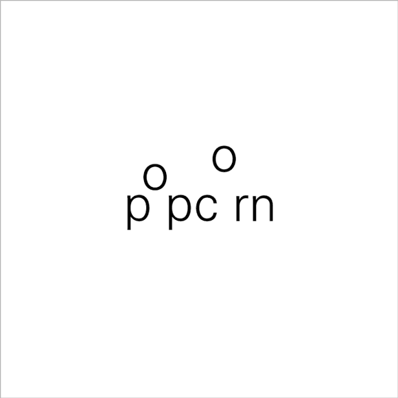
expressive type, done by typographically enhancing the meaning of a word.  We had to choose 6 words from a large list and enhance them, and also choose 2 of them to be printed out on foam core (Which is AWESOME! btw)  Here are a bunch of examples:


I got kinda frustrated with this project because I'm not familiar with the software yet. l didn't know whether to use Illustrator or InDesign, it seemed confusing at first.  We had been using InDesign for the weekly assignments, and that was just applying adjustments to text and layout.  Kerning, leading, baselines, drop caps, margins, stuff like that.  That stuff is a breeze now, ha ha...well sorta.  

I'm hitting the mac lab as often as I can and doing online tutorials to teach me how to use Illustrator and InDesign now..  Our Teacher did not and assumed we knew the software already.  Gotta love adjunct teachers.

I got a B- 

I'm actually happy with the grade for it being my 1st project using this type of software.  Printing it out on foam core was cool too.  I could see myself doing that more often, even with my own artwork.

So here are the two I printed on foam core


Tuesday, November 15, 2011

Tuesday's Type: Roboto


The following article was originally posted by Matias Duarte, a Google employee on his Google+ page.  He's part of the Android Experience Team, so there was no hesitation in adding him to "My kinda Industry" circle in my Google+.  He goes into detail on how Roboto was created, the design process, and how its going to impact our daily lives.  I thoroughly enjoyed reading about the different elements that go into designing type for the mobile user interface.  Articles like this are inspiring to me, and I find myself soaking it all up like a sponge.  If you're reading this and on't have a Google+ account yet, get one!  Google Employees give "behind the scenes info", Graphic Designers share their knowledge, Developers and Programmers share the latest tweaks, hacks, and opions.  It's truly made jumping into the user interface design field easier and educational, and who should say "no" to networking with the experts.  Also here is a link for the download so you can start using it now!  I have it on my Droid X now  :p.

Hello RobotoWhen we announced Ice Cream Sandwich I also got a chance to introduce Android’s new typeface Roboto. Today I’d like to talk about how Roboto was born — why we decided to create it, and the design choices we made in the process.
Why replace Droid?Droid is a great font family which served Android well over the years, but it was designed and optimized for screens that were much lower in pixel density than today’s HD displays. To be legible at smaller sizes, and to avoid turning to anti-aliased grey mush, the letter forms had to be quite dramatic. They had a tall x-height and a very regular rhythm so that they snapped to the pixel grid crisply. The bold variant was significantly wider than the regular text, because when a letter’s vertical strokes are one pixel thick, the only way to be bold is to double! It’s no surprise that on high rez screens, and at larger more dramatic headline sizes, Droid struggled to achieve both the openness and information density we wanted in Ice Cream Sandwich.
What were we looking for?Most important was to create something that matched our ambitious design goals for Ice Cream Sandwich. Emotionally we wanted Ice Cream Sandwich to enchant you, to be attractive and eye-catching. Our new typeface had to be modern, crisp, and structured to match our new emphasis on open layouts and rigid grid alignments, but also friendly and approachable to make Android appealing, and a little bit more human. 
Interactive display is a new and still evolving medium and what it demands from type design is subtly and uniquely different from print. We wanted to take maximum advantage of ultra high density screens like that of Galaxy Nexus, yet still be crisp and legible on lower resolution displays like that of Nexus S. Because Roboto would be used for the UI we wanted to make the bold very similar to the metrics of the regular weight, so that text could gracefully switch from bold to regular (like when you read emails in your inbox). We also wanted to include tabular figures (numbers that are all the same width) so we could display times, dates and other counters without having the characters jump around.
Finally we wanted Roboto to make a design statement in and of itself, in the same way that we wanted every screen on the device to have a strong and unique design point of view. Yet, just like the rest of the UI, Roboto is ultimately a medium for your content. We wanted Roboto to have a design character that made it recognizable, to be distinctive when you were paying attention, but never be overbearing or distracting.
How did we make it?We realized early on that we needed something with a strong geometric backbone to hold up to our new open “Magazine UI” layouts. When we got rid of the boxes and bevels, dividers and other structural crutches, the more humanist fonts of our legacy felt uncomfortable and a little chaotic. Naturally we looked at some of the circle based geometrics like Avenir and Futura, but they’re very demanding in the rhythm of their metrics and ultimately were a little too soft for the crisp corners that we were using in the UI. The breakthrough came quickly when we settled on a straight sided grotesk.
Roboto’s straight sided capitals and distinctive racetrack-shaped rounded letters turned out to be perfect for our needs in a system font. It is space efficient and and holds its own for the short terse messages that are so common in UI. It has a high degree of compatibility with legacy designs created for Droid, because in almost all cases the same size Roboto sets in the same amount of space. Yet because of Roboto’s more structured forms we can actually set it smaller and with tighter line spacing, allowing us to put more information on the screen without inducing claustrophobia.
One of the potential drawbacks of a grotesk font is that the structured evenness of the type can make it more difficult to read. We started by softening up the lower case letters, and then experimented with opening up some of the glyphs to get a more diverse rhythm. We found that by adding a little more diversity to the lower case the font become more readable. In particular, we opened up the ‘e’ and ‘g’ while keeping the ‘a’, ‘c’ and ‘s’ characters closed. The rhythm starts to compare more to book types and makes for really nice reading over longer spans of text.
In the end we were iterating ceaselessly on minor details of the letters, extending the character set to Greek and Cyrillic, and tweaking the rendering so that Roboto would look just as good at all sizes and resolutions. In fact our work is not yet done as we continue to extend the character set and begin to hint Roboto so it works as well on computers as it does on Android devices. Still, I’m terrifically proud of the work the team and our lead typographer did in an ludicrously short amount of time. Roboto is a new foundation for Android and the team really deserves kudos for their accomplishment.
I hope you’ve enjoyed this little ‘behind the scenes’ peek at Android’s evolution. I had fun writing it, so let me know if you’d be interested in hearing more.

Wednesday, November 9, 2011

224 pages later...

I finished reading my 1st book on Typography!  "Thinking with Type" by Ellen Lupton. The book was $25, and an easy read.  It's broken into 3 chapters; Letter, Text, and Grid. Each subtopic was no more than 4-5 pages but jammed packed with lots of examples. Good examples, bad examples, they are all there. I was surprised to find out some typography teachers don't have a book requirement. I'm glad mine did. I notice things when looking at posters and flyers now for example. I'm paying more attention to layouts and their use of space on everything now.  This class, with the help of this book has totally changed the "type" of detail I'm paying attention to.

Friday, November 4, 2011

Posters! Flyers! = $weet $ide job$

When I signed up for typography this semester I had one thing on my mind. Fonts. Actually typeface would be the correct terminology for what was on my mind, which is the design of the letter forms. Font is actually the delivery mechanism. I find it easier to understand in digital terms, like my word processor providing me Helvetica in the bold font so that I can import it to adobe products for a rockin' poster or flyer for as the output. Either way, in this day in age, we all know what we mean when we use the two.  


There is so much more to Typography than typeface and fonts. It's true, watch the movie "Helvetica" (it's on Netflix instant and Youtube now). Typography is all about the style and appearance of something, printed or digital. Pictures are governed by rules of typography, the space you use in, out, and around the letters....all fall under Typography.  


My final project for Typography is to design a World Events poster. My teacher has us using Adobe Illustrator and InDesign, which are all new software products for me. I don't have those products myself, so I'm hittin' the Mac Labs at school as frequently as possible.  


When I think of posters, I'm not gonna lie i think of pictures. This assignment requires we use only typography to express our message. I have definitely  seen many flyers in my day and posters, and these are some examples that I'v been viewing on the web to rattle my brain and get that creativity flowing.


Those are some great examples of posters that have no actual image, except for ones made by letters. I want to design posters and flyers like this. Practice makes perfect, even if I'm going for a digital or web format. Bottom line page layout and/or typography are key.


The thing that sucks about the project is that there are 10 topics to choose from, and we can't stray from the list. Topics like...

  • 2011 International Year of Forests
  • March  11, 2011 Japanese Earthquake and Tsunami
  • May 1, 2011, Death of Osama bin Laden
  • April 11, 2011 French legislation bans full-face coverings
  • July 11, 2011 Scandal brings end to The News Of The World


I chose the death of Amy Winehouse :( . I'm also doing an additional topic for extra credit.  Not sure what my 2nd choice will be yet. This project is no joke either, I have sketches, concepts, and the processes used to include, along with it being mounted. 20 sketches due next week.  That's 20 each topic.  Yes.  40.   *whip crack*


I'm starting this project early, and I'm really gonna work hard to impress with these projects so I can include them in a portfolio in the future. You watch!